Badges
The LIVCK Badge Feature allows you to generate embeddable status badges for your monitors, categories, global status, or uptime. These badges can be embedded on any website, documentation, or application to display real-time status information.
Badge Types
Monitor Status
Displays the current status of a specific monitor.
- Shows operational, degraded, outage, or maintenance status
- Optional SLA percentage display
- Animated status dot (optional)
Category Status
Displays the aggregated status of all monitors in a category.
- Shows worst-case status of all monitors in the category
- Useful for grouping related services
Global Status
Displays the overall system status.
- Aggregates all monitors across all categories
- Perfect for high-level status overview
Global Uptime
Displays the overall uptime percentage over a selected timeframe.
- Available timeframes: 7 days, 30 days, 90 days
- Shows percentage-based uptime metric
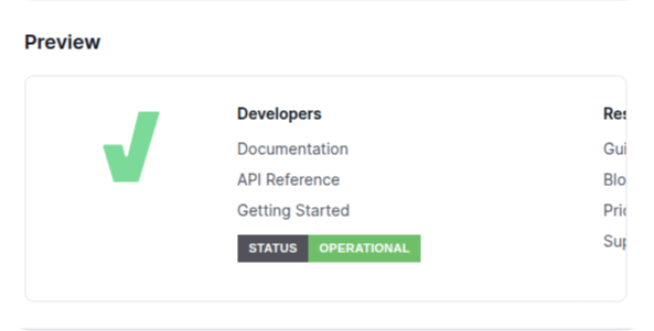
Badge Styles
LIVCK offers four distinct badge styles to match your design needs:
Pill Style
Rounded, modern badge with full border radius
- Best for: Modern websites, dashboards, hero sections
- Use case: Primary status display on landing pages
Compact Style
Moderately rounded badge with minimal spacing
- Best for: Compact layouts, sidebars, headers
- Use case: Navigation bars, compact status sections
Flat Style
GitHub-style flat badge
- Best for: Documentation, README files, GitHub pages
- Use case: README files, technical documentation, developer portals
Inline Style
Minimal badge for inline text placement
- Best for: Footer links, inline text, navigation menus
- Use case: Footer status links, inline status indicators
Integration Methods
LIVCK offers four different ways to integrate status badges:
1. Widget (Recommended)
Lightweight JavaScript widget that inherits your page's styles
<span
  data-livck-badge="status"
  data-livck-style="pill"
  data-livck-theme="auto"
></span>
<script src="https://status.example.com/widget.js" defer></script>
Advantages:
- ✅ Inherits parent page fonts and styling
- ✅ No iframe isolation issues
- ✅ Zero dependencies (vanilla JavaScript)
- ✅ Lightweight (less than 10KB minified)
- ✅ Auto-refresh capability
2. HTML Iframe
Traditional iframe embedding
<iframe
  src="https://status.example.com/api/v3/badge/status?style=pill&theme=auto"
  frameborder="0"
  scrolling="no"
  style="width: 220px; height: 36px;"
  title="Status Badge"
></iframe>
When to use:
- Need strict style isolation
- Embedding in email templates
3. Markdown
For documentation and README files
[](https://status.example.com)
Perfect for:
- GitHub README files
- GitLab documentation
- Documentation portals
4. Direct URL
Direct link to badge endpoint
https://status.example.com/api/v3/badge/status?style=pill&theme=auto
Customization
Theme Options
Auto Theme
- Automatically adapts to the user's system preference (light/dark mode)
- Detects
prefers-color-schememedia query
Light Theme
- Fixed light theme regardless of system preference
- Light background, dark text
Dark Theme
- Fixed dark theme regardless of system preference
- Dark background, light text
Custom Colors
Customize colors for each status state:
- Operational (default: green
#22c55e) - Degraded (default: yellow
#eab308) - Outage (default: red
#ef4444) - Maintenance (default: blue
#3b82f6)
You can also customize theme colors (background, text, border) for both light and dark modes.
Custom Labels
Use custom labels with dynamic placeholders:
%name%- Replaced with monitor/category name- Custom text - Any static text you want to display
- Examples:
API Status,%name% - Live Status,System Health
Animation
Optional animated status dot for visual feedback.
- Subtle pulse animation on operational status
- Draws attention to live status updates
Widget Configuration
Basic Widget Setup
<span
  data-livck-badge="monitor:uuid-here"
  data-livck-style="compact"
  data-livck-theme="dark"
  data-livck-locale="en"
  data-livck-animate="true"
  data-livck-sla="true"
  data-livck-label="API Status"
></span>
<script src="https://status.example.com/widget.js" defer></script>
Available Attributes
| Attribute | Options | Default | Description |
|---|---|---|---|
data-livck-badge | status, uptime, monitor:uuid, category:uuid | required | Badge type |
data-livck-style | pill, compact, flat, inline | pill | Badge style |
data-livck-theme | auto, light, dark | auto | Color theme |
data-livck-locale | en, de | en | Language |
data-livck-animate | true, false | true | Animated dot |
data-livck-sla | true, false | false | Show SLA % |
data-livck-label | text or %name% | empty | Custom label |
data-livck-days | 7, 30, 90 | 30 | Uptime days |
Custom Colors in Widget
<span
  data-livck-badge="status"
  data-livck-colors='{"operational":"#10b981","degraded":"#f59e0b"}'
></span>
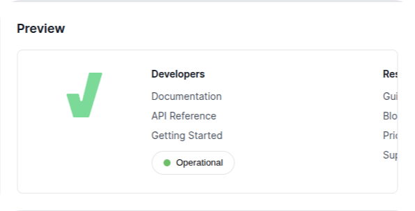
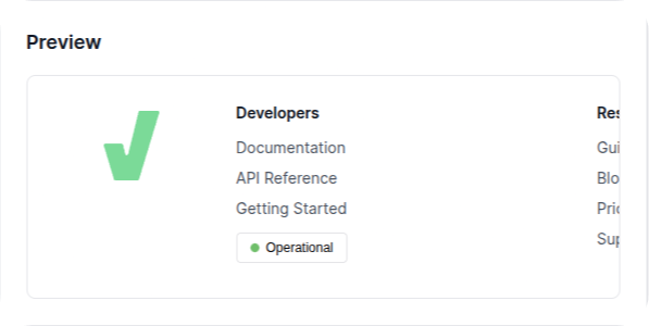
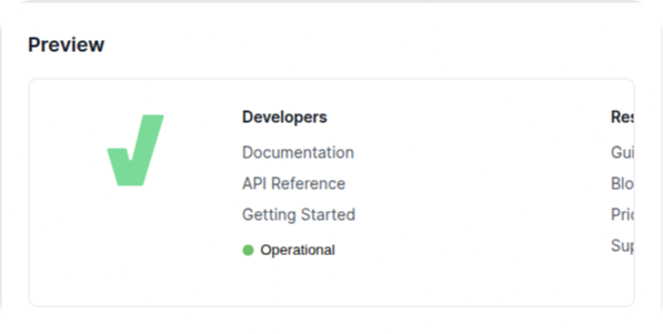
Badge Builder
Access the Badge Builder in your LIVCK dashboard:
Settings → Badge Builder
Features:
- Configuration Tab - Select badge type, style, theme, language, and options
- Colors Tab - Customize all colors with live preview
- Preview Panel - See your badge in real-time
- Code Snippets - Copy-paste ready code for all integration methods
All settings are saved to your browser and persist between sessions.
Use Cases
Website Footer
<footer>
  <div class="status-link">
    <span
      data-livck-badge="status"
      data-livck-style="inline"
      data-livck-theme="dark"
    ></span>
  </div>
</footer>
<script src="https://status.example.com/widget.js" defer></script>
GitHub README
# My Project
[](https://status.example.com)
Dashboard with Multiple Services
<div class="services">
  <div>
    <span>API Gateway:</span>
    <span data-livck-badge="monitor:api-uuid" data-livck-style="compact"></span>
  </div>
  <div>
    <span>Database:</span>
    <span data-livck-badge="monitor:db-uuid" data-livck-style="compact"></span>
  </div>
</div>
<script src="https://status.example.com/widget.js" defer></script>
Private Page Support
Badges work seamlessly with private status pages using signed URLs with 10-year expiration for long-term embedding.
Localization
Badges support multiple languages:
- English (
en) - German (
de)
Status messages are automatically translated based on the selected language.
Best Practices
Style Selection
| Style | Best For | Avoid For |
|---|---|---|
| Pill | Hero sections, prominent placement | Inline text, compact spaces |
| Compact | Headers, sidebars, navigation | Large empty spaces |
| Flat | GitHub, documentation | Non-technical audiences |
| Inline | Footer links, inline text | Primary status display |
Performance
- Use inline style for footer integration (smallest footprint)
- Set appropriate iframe dimensions to avoid layout shifts
- Widget auto-refreshes every 60 seconds by default
Troubleshooting
Badge Not Displaying
- Check that the status page is accessible
- Verify the badge URL is correct
- Check browser console for errors
Colors Not Applying
- Ensure colors are valid hex codes (e.g.,
#22c55e) - Clear browser cache
- Regenerate badge with Badge Builder
Badge Shows Outdated Status
- Refresh the parent page
- Check monitor status in LIVCK dashboard
- Verify no aggressive CDN caching
Additional Resources
- Private Page - Secure your status page
- Permissions - Control access to Badge Builder